Landing Page Optimization: Converting Visitors into Customers
Speaking Their Language
Features tell—benefits sell. Transform every technical specification into a real-world outcome your customer cares about. That military-grade encryption becomes sleep-easy security knowing your data stays private. The AI-powered algorithm translates to spend 10 hours less per week on repetitive tasks.
Here's a powerful exercise: For every feature, ask So what? three times. Our software integrates with Slack → So what? → Teams get instant notifications → So what? → Projects move forward 30% faster without waiting for email replies → So what? → Companies hit quarterly targets with less overtime stress. That final so what is where the real value lives.
Keeping It Crystal Clear
Clarity trumps cleverness every time. Your value proposition should pass the airport test—could someone understand it during a quick walk between terminals? Strip out industry jargon, acronyms, and vague claims. Instead of leveraging synergistic paradigms, say helps teams work better together.
Try this framework: [Product] helps [target audience] [achieve benefit] by [unique approach]. Example: Canva helps small businesses create professional designs in minutes with drag-and-drop simplicity. When your grandmother and your tech-savvy intern both get it immediately, you've nailed clarity.
Testing and Evolving
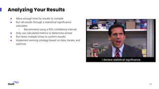
Your value proposition isn't set in stone—it's a living message that should evolve with your market. Run A/B tests with different headlines on your homepage. Try varying the order of benefits in your sales emails. Track which versions generate more demo requests or faster reply times.
Create a simple survey asking recent customers: What almost stopped you from buying? and What finally convinced you? Their answers often reveal gaps between what you think matters and what actually sways decisions. Every customer interaction is data—mine it relentlessly to sharpen your message.
Optimizing for User Experience (UX)

Walking in Their Shoes
Exceptional UX begins with radical empathy. Observe real people using your product in their natural environment—you'll spot frustrations they'd never think to mention. Notice where their cursor hovers uncertainly, which menu items they click repeatedly, or when they sigh in frustration. These micro-interactions reveal more than any survey ever could.
Create journey maps that document every touchpoint—from first hearing about your product to becoming a power user. Where are the emotional highs and lows? The moments of delight and points of friction? Optimize for the entire experience, not just the conversion moment. Sometimes improving customer support response times does more for retention than any homepage tweak.
Designing Effortless Paths
Navigation shouldn't require instructions. Your information architecture should feel intuitive within the first eight seconds. Use card sorting exercises with actual users to see how they naturally group features and content. Watch for patterns in how they describe your offering—their language should shape your menu labels.
Implement breadcrumb navigation for complex processes. Ensure every page answers three questions within the first scroll: Where am I? What can I do here? Where do I go next? When users report that everything was just where I expected it, you've achieved invisible design.
Building for Everyone
Accessibility isn't just compliance—it's good business. Nearly 15% of the global population lives with some form of disability. Simple fixes like proper alt text, keyboard navigation, and color contrast adjustments open your product to millions while improving the experience for all users.
Localization goes beyond translation—consider cultural interpretations of colors, gestures, and symbols. That green go button might signify illness in some markets. Time zone-aware interfaces, inclusive imagery, and flexible text sizing demonstrate respect for diverse users. These thoughtful touches often become unexpected competitive advantages.
Leveraging Persuasive Copywriting

Headlines That Hook
You have three seconds to grab attention—make them count. The best headlines either promise a transformation or trigger curiosity. Double Your Open Rates in 3 Days works because it's specific and outcome-focused. The Email Strategy Your Competitors Hope You Never Discover plays on curiosity and fear of missing out.
Test emotional vs. rational appeals for your audience. Numbers often increase credibility—7 Mistakes That Kill Conversions performs better than vague warnings. When stuck, try the X Ways to Y Without Z formula—it works across industries.
Knowing Their Inner Dialogue
Great copywriters don't just know their audience—they can recite their unspoken objections verbatim. What hesitations live between Add to Cart and actually clicking? Is it price sensitivity? Fear of complexity? Uncertainty about results?
Create an objection bank from real customer service logs and sales calls. Address these concerns preemptively in your copy with social proof, guarantees, or clear explanations. When customers feel understood rather than sold to, resistance melts away.
Establishing Trust
In an age of skepticism, credibility is currency. Case studies with concrete metrics outperform vague testimonials every time. Increased revenue by 37% in Q2 builds more trust than Great service!
Show don't tell—demonstrate expertise through insightful content that solves real problems. A single well-researched whitepaper can do more for conversions than a dozen promotional emails. When you educate first and sell second, customers come to you ready to buy.
Visual Storytelling
The right image can replace paragraphs of text. Use before/after sliders to show transformations. Process diagrams make complex systems understandable. Annotated screenshots guide users more effectively than written instructions alone.
Video testimonials capture emotion that text can't—watch how customers' faces light up when describing results. These authentic moments build connection faster than any polished ad. Just ensure videos have captions for silent autoplay and skimmability.
Analyzing and Refining Performance
Choosing the Right Metrics
Not all metrics deserve your attention. Focus on 2-3 north star metrics that directly tie to business outcomes. For SaaS, maybe it's activation rate—the percentage who experience your product's core value. For ecommerce, perhaps average order value combined with return customer rate.
Set up cohort analysis to see how changes affect user behavior over time. Did that homepage redesign actually improve retention after 30 days? Vanity metrics like page views often distract from what truly matters—real business impact.
Following the Digital Breadcrumbs
Heatmaps reveal what grabs attention (and what gets ignored). Notice where users rage-click—frustration points begging for redesign. Scroll maps show how far most visitors read before leaving—is your key message above the fold?
Session recordings expose unexpected behavior—that button everyone hovers over but rarely clicks, or the form field that consistently causes abandonment. Sometimes fixing a single confusing element lifts conversions more than a complete overhaul.
Smoothing the Journey
Plot your conversion funnel like a detective solving a mystery. Where do the most potential customers disappear? That checkout page with a 70% drop-off needs immediate attention—maybe shipping costs appear too late.
Implement progressive profiling—only ask for essential info upfront, then gather more details later. Each unnecessary field can cost you 10-15% in conversions. Test multi-step vs. single-page forms—sometimes breaking it up feels less daunting.
Learning From the Competition
Run SWOT analyses on competitor landing pages—what are they doing well? Where do they fall short? Their customer reviews reveal unmet needs you can address. Tools like SimilarWeb show their traffic sources—are they crushing it with podcasts you've overlooked?
But don't just copy—differentiate. If everyone in your space brags about speed, perhaps emphasize personalized service instead. The gaps in their offerings are your opportunities.
Read more about Landing Page Optimization: Converting Visitors into Customers