Heatmaps and Scroll Maps for Website Optimization
What are Heatmaps and Scroll Maps?
Understanding Heatmaps
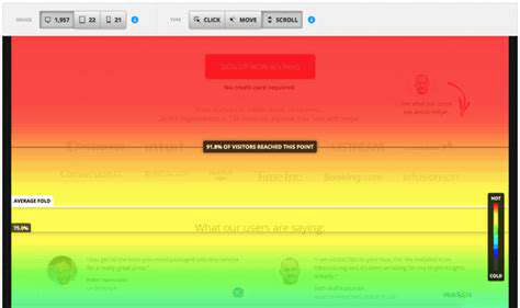
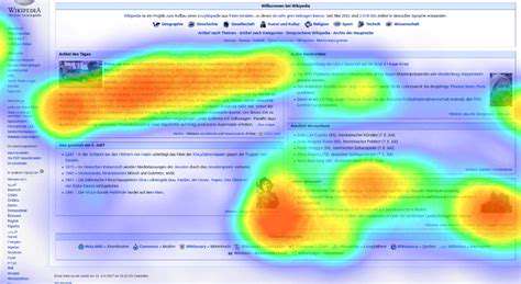
Heatmaps serve as visual representations of data, showcasing the intensity or frequency of activity across a defined space. They employ color gradients where darker hues typically signify higher values and lighter shades denote lower values. This visualization technique offers a straightforward method to spot patterns and trends, proving invaluable for analysis across diverse sectors.
These tools excel in revealing user behavior on digital platforms. By monitoring interactions like clicks or scrolls, heatmaps highlight high-engagement zones and areas needing refinement. For instance, numerous clicks on a specific button might indicate effective design, while sparse interaction could signal layout issues.
The Role of Scroll Maps
Scroll maps, a specialized heatmap variant, concentrate on scrolling patterns. They demonstrate how far users navigate down a page, emphasizing popular sections and overlooked content. This data helps optimize layouts to boost engagement and enhance user experience.
Scroll maps prove essential for verifying content reach. By illustrating scrolling habits, businesses can determine if vital information gets noticed or if users abandon pages prematurely. Such insights are critical for refining website structure and content placement.
Data Visualization Techniques
Both heatmaps and scroll maps employ advanced visualization methods. Their strength lies in simplifying complex data, enabling rapid identification of trends without deep statistical expertise.
These tools transform numerical data into accessible visuals, helping stakeholders quickly grasp key insights for informed decision-making regarding design and user experience.
Applications in Web Design and UX
Digital designers and UX researchers increasingly rely on these visualization tools. They offer crucial insights into user interactions, guiding improvements in website functionality and effectiveness.
Tracking user clicks and scrolls reveals pain points like confusing navigation or weak calls-to-action. This feedback facilitates continuous design enhancements, ultimately creating more intuitive digital experiences.
Identifying Areas for Improvement
These visual tools pinpoint specific webpage elements needing attention. Heavy click concentration might indicate successful features, while sparse interaction could suggest necessary design or content adjustments.
Understanding User Engagement
Heatmaps and scroll maps provide vital engagement metrics by visualizing content interaction patterns. Analyzing these patterns helps businesses evaluate design effectiveness and content strategy.
Insights from engagement data can significantly boost conversions and user satisfaction. These tools offer essential feedback for ongoing website optimization and improved user experiences.
Beyond Web Analytics
While commonly used for websites, these visualization techniques have broader applications. Educational institutions might analyze student engagement with materials, while retailers could study customer interaction with product displays.
These adaptable tools extend far beyond digital interfaces. By understanding interaction patterns across various contexts, organizations can better tailor their offerings to audience needs.

Implementing Heatmaps and Scroll Maps for Enhanced Website Optimization
Understanding Heatmaps
Heatmaps visually represent data patterns through color gradients, with darker shades indicating higher values. This intuitive format quickly reveals areas of activity, interest, or importance. In web analytics, they show user interaction hotspots, guiding design refinements.
Proper interpretation requires understanding the underlying data context. Different metrics like click rates or engagement levels produce distinct heatmap patterns, making accurate data comprehension essential for valid conclusions.
Implementing Scroll Maps
Scroll maps track user navigation through content, revealing engagement duration and scroll depth. These insights help optimize content placement, ensuring key information receives proper attention while identifying potential drop-off points.
Beyond simple click tracking, scroll maps provide nuanced understanding of content consumption patterns. This detailed behavior analysis proves invaluable for improving information architecture and user flow.
Combining Heatmaps and Scroll Maps
Integrated analysis from both tools delivers comprehensive user behavior insights. Heatmaps identify attention hotspots while scroll maps reveal navigation patterns, together offering complete interaction context.
This combined approach enables truly data-driven design decisions. The synergy between these tools uncovers optimization opportunities that might otherwise remain hidden, leading to more effective user experiences and potentially higher conversion rates.
Synthesizing both visualizations provides unparalleled understanding of user engagement. This comprehensive perspective allows for precisely targeted improvements to digital platforms.
Read more about Heatmaps and Scroll Maps for Website Optimization


Hot Recommendations
- Personalizing Email Content with User Behavior
- Geofencing for Event Attendance Tracking
- Reputation Management on Social Media
- UGC Beyond Photos: Videos, Testimonials, and More
- The Future of Data Privacy Regulations
- Accelerated Mobile Pages (AMP) Benefits and Implementation
- The Future of CRM: AI and Voice Integration
- Google Ads Smart Bidding Strategies: Maximize Value
- Common A/B Testing Pitfalls to Avoid
- Local SEO Strategies for Small Businesses