Responsive Design vs Adaptive Design: Which is Better?
Understanding Fluid Layouts and Their Flexibility
Modern web design increasingly favors fluid layouts because they adapt dynamically to various screen dimensions. Unlike rigid fixed-width designs, fluid layouts use percentage-based measurements to resize elements proportionally. This ensures content remains readable and visually balanced whether viewed on a 27-inch monitor or a 5-inch smartphone. The key advantage lies in their future-proof nature - as new devices emerge with unconventional screen sizes, fluid designs automatically accommodate them without requiring code modifications.
Implementing fluid layouts does present some challenges. Designers must carefully consider minimum and maximum widths to prevent awkward stretching on ultra-wide screens or uncomfortable squeezing on smaller devices. Strategic use of CSS media queries helps refine the layout at specific breakpoints, ensuring optimal presentation across the entire spectrum of devices. When executed properly, this approach creates seamless experiences that keep users engaged regardless of their viewing environment.
Exploring Fixed Layouts and Their Limitations
Fixed layouts continue to serve specific purposes in web design, particularly for projects requiring pixel-perfect precision. These designs maintain exact dimensions regardless of viewing device, which can be advantageous for certain types of content presentation. Print-style layouts, complex data visualizations, and some e-commerce product displays often benefit from this consistent, unchanging structure.
However, the digital landscape's increasing diversity exposes fixed layouts' shortcomings. Mobile users frequently encounter horizontal scrollbars or clipped content, creating frustrating experiences that lead to higher bounce rates. While hybrid approaches that combine fixed and fluid elements can mitigate some issues, purely fixed designs struggle to meet modern expectations for responsive, device-agnostic content delivery.
Responsive Design: The Fluid Approach
Understanding the Core Principles of Responsive Design
Responsive design represents an evolution in web development philosophy, prioritizing content adaptability over rigid presentation rules. This methodology employs three fundamental technical components: fluid grids that scale proportionally, flexible images that resize appropriately, and media queries that apply conditional styling. By combining these elements, responsive websites automatically reconfigure their layout to provide optimal viewing experiences across the full range of modern devices.
Advantages and Challenges of Implementing Fluid Layouts
The primary benefit of responsive, fluid design lies in its universal accessibility. Visitors receive properly formatted content whether they access a site from a smartwatch or ultra-wide desktop monitor. This consistency improves engagement metrics and supports better search engine rankings through reduced bounce rates and increased time-on-site. However, fluid design demands more thoughtful planning than traditional fixed approaches.
Performance optimization becomes particularly crucial with fluid designs. Large images that scale down for mobile devices still load at full resolution unless properly managed. Progressive loading techniques, adaptive image delivery, and careful asset compression all play vital roles in maintaining fast performance across connection speeds. These technical considerations require additional development effort but yield substantial dividends in user satisfaction.
Best Practices for Developing Fluid and Responsive Websites
Successful responsive projects typically follow a mobile-first development philosophy. This approach forces designers to prioritize content hierarchy and streamline interfaces from the outset. Modern CSS tools like Flexbox and Grid Layout provide powerful options for creating flexible structures that maintain their integrity across device sizes. Vector graphics (SVGs) prove especially valuable as they scale losslessly to any dimension.
Thorough testing remains essential throughout the development process. Real-device testing provides the most accurate assessment of how layouts behave under actual usage conditions. Automated testing tools can simulate various devices, but nothing replaces hands-on evaluation with physical hardware. Establishing clear performance benchmarks and regularly measuring against them helps maintain quality standards throughout the project lifecycle.
Adaptive Design: Predefined Layouts for Optimal Performance
Understanding the Core Principles of Adaptive Design
Adaptive Design takes a more prescriptive approach than fluid responsive design, delivering specific layout versions tailored to common device categories. This technique detects the user's device characteristics and serves an optimized template designed for that form factor. The precision of adaptive layouts often results in superior visual fidelity compared to fluid approaches, as designers can fine-tune each version for its intended display environment.
Advantages and Limitations of Predefined Layouts in Adaptive Design
Adaptive design shines when performance and targeted optimization are priorities. By eliminating unnecessary elements for specific device classes, these layouts typically load faster and operate more efficiently than their fluid counterparts. The ability to tailor interactions and content presentation for different contexts can significantly enhance usability, particularly for complex applications.
The maintenance overhead of adaptive design presents its most notable drawback. Each new device category or screen size may require creating additional layout versions, increasing development and testing requirements. This can lead to technical debt over time as the proliferation of devices continues unabated. Careful planning and modular design practices help mitigate these challenges but require disciplined implementation.
Performance Considerations and User Experience

Optimizing Performance for Better User Experience
Website performance directly impacts user satisfaction and engagement metrics. Studies consistently show that even minor delays in page loading increase bounce rates dramatically. Effective optimization begins with asset management - compressing images, minifying code, and leveraging browser caching all contribute to faster delivery. Modern techniques like lazy loading prioritize above-the-fold content, creating the perception of faster performance.
Performance monitoring should be an ongoing process, not just a final development step. Tools like Lighthouse provide actionable insights into potential improvements, while real-user monitoring captures actual visitor experiences. Establishing performance budgets helps teams maintain focus on optimization throughout the development lifecycle rather than attempting costly remediation after deployment.
Effective Use of Resources and Technologies
Strategic technology selection can dramatically improve website performance. Content Delivery Networks (CDNs) reduce latency by serving assets from geographically distributed servers. Modern JavaScript frameworks offer built-in optimization features like code splitting and tree shaking to minimize payload sizes. The choice of hosting infrastructure should align with expected traffic patterns and performance requirements.
Frontend optimization must be balanced with backend efficiency. Database queries, API responses, and server-side processing all influence the overall user experience. Implementing caching strategies at multiple levels can significantly reduce server load while improving response times. A holistic approach to performance considers the entire technology stack, from the user's device to the data center and back.
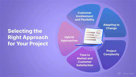
Choosing the Right Approach: Tailoring to Specific Needs
Understanding Your Unique Needs and Goals
Selecting the optimal web design approach requires careful consideration of business objectives and audience requirements. Content strategy should drive technical decisions rather than the reverse. Organizations with content-heavy sites may prioritize fluid responsive designs, while application-centric projects might benefit from adaptive techniques. Audience analysis helps determine which devices and browsing contexts require primary support.
Evaluating Available Options and Resources
Practical constraints often influence technical choices as much as ideal scenarios. Development team skillsets, existing infrastructure, and maintenance capabilities all factor into approach selection. Hybrid solutions frequently offer the best balance, combining fluid elements for general content areas with adaptive components for critical interfaces. The decision matrix should weigh short-term implementation costs against long-term maintenance requirements.
Implementing a Flexible and Adaptive Plan
Regardless of the chosen methodology, successful implementation requires flexibility. Agile development practices help accommodate evolving requirements and emerging device standards. Building with progressive enhancement ensures core functionality remains accessible even when advanced features encounter compatibility issues. Regular usability testing validates design decisions and identifies areas needing adjustment.
Monitoring and Measuring Success Effectively
Defining clear success metrics before launch establishes accountability for design decisions. Analytics should track not just overall traffic, but device-specific engagement patterns and performance metrics. Conversion funnels may reveal unexpected friction points related to layout or performance issues. Continuous optimization based on real-world data helps maximize return on design investment over time.
Read more about Responsive Design vs Adaptive Design: Which is Better?

Hot Recommendations
- Personalizing Email Content with User Behavior
- Geofencing for Event Attendance Tracking
- Reputation Management on Social Media
- UGC Beyond Photos: Videos, Testimonials, and More
- The Future of Data Privacy Regulations
- Accelerated Mobile Pages (AMP) Benefits and Implementation
- The Future of CRM: AI and Voice Integration
- Google Ads Smart Bidding Strategies: Maximize Value
- Common A/B Testing Pitfalls to Avoid
- Local SEO Strategies for Small Businesses